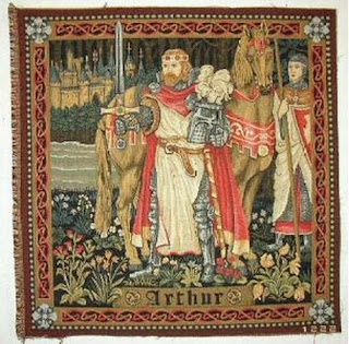
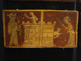
I really like the use of just two colours here, and that it's not plain black and white. The chiseled illustrations look really clean with the use of simple lines, the proportions are not to scale and alltogether we have a flat looking picture with no depth percetion.
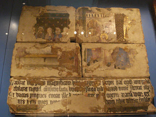
I love how the paint is crumbling and peeling off and how it's cast over the bricks.
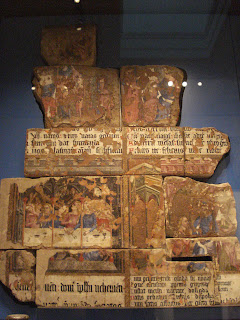
The main colours on this are blue and red, royal and religious colours. Calligraphy text telling us whats going on in the painted scene.
So for my prophecy, i want to combine the 2d flat images with the engraved look, i plan to do this by drawing my images in photoshop and maybe try applying them as a bump to get the engraved look.
Prophecy Illustrations.
Arthur Sword in the Stone
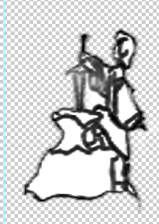
Arthur as King

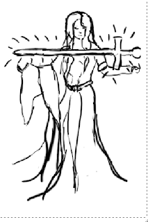
Lady of the Lake with Excalibur
Adding the texture
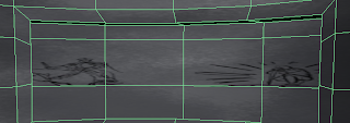
So firstly i positioned the images onto the uv snapshot for the colour texture. The images came out distorted which was because my uv snapshot wasn't clear on the faces. I guess in the long run i should have just changed the UV map but i didn't want to have to shuffle the whole bump for the wall ext, though i think you can maybe create a new UV set and do it that way. But basically i kept what i already had and found the scales that fit the uv snapshot.

Here i tried the bump map whilst the colour texture is on too, we can see the difference and i prefer the bump instantly, it draws more attention.
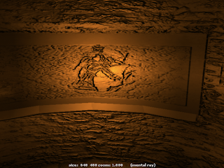
So i thought i should stick a quick volume light in so we can see what's going on. I tried applying that bump of the flaking paint texture i found on the website i got the concrete from, but it's not really happening ..
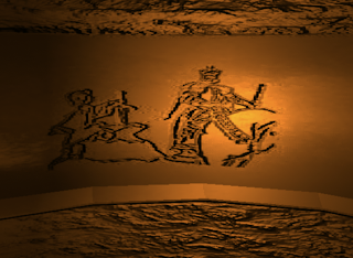
So i thought to just try using a concrete bump for a minimal effect, also in the bump for the prophecy drawings i noticed that it's not as clear as i'd like so i sorted out that in photoshop..
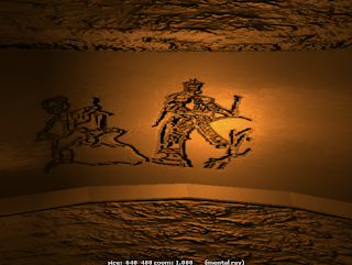
.. and the image looks more even on the bump now.
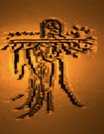
My first illustration of Lady of the Lake didn't turn out very well as there were too many lines on the photoshop file and it's just not very clear at all.
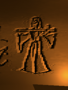
So after cleaning up the lines i think this works much better.
Ideally if i had more time i would have loved to explore the variety of effects i could have done to bring this out more.
No comments:
Post a Comment